This is a blog dedicated to my A2 media work


For this video in particular it’s hard to pick out a narrative, this may be due to the sheer complexity of the plot and the fact that the lyrics have no relation to the lyrics. The video almost has two narratives, the first being the two actors dreams, I think that when the two actors were lying dead at the bottom of the cliff, this was their dream. And the second being in real life, and what happened to the actors and how they ended up dead.
The video starts and ends in the same place, it’s almost like a circular narrative. At the start of the video the two singers are wondering through the desert, and at the end we see the two singers lying face down at the bottom of a cliff either passed out or dead. This is a very clever video because it effectively plays with time, starting at the end of the narrative and then goes back to the beginning of the narrative half way through the video.
The video starts off with a long intro, the beats to the music are used as diajetic sound, the camera flicks to a bug falling of a bell to the sound of the beat, and shots change to the sound of the beat. When the actual music starts the camera changed to the two singers. The two singers look almost tribal like in their costumes and with their faces painted. Overall they look different to every person they meet. This correlates with the lyrics: We are the people who rule the world, suggesting they are superior to everyone else and at the start it emphasised that they are on their own; this is the only part of the lyrics that relates to the video.
The lighting is different to most other pop videos, mainly because the lighting gives some of the shots a sun kissed look with sun rays streaming through the trees in the rain forest scene. This leaves the sun pouring through the camera lenses to make the rain forrest look vibrant. At the start if the video quick editing is present, then as the music starts the editing fades slowly to correspond with the mellow music.
In some parts of the video the two singers are performing to the camera, like they are almost showing and telling us what happened to them. They stay in character throughout the whole video. Although they are in 'character' they are still playing them selves, dressing the same and having their make-up in the same style as they usually do.

Throughout the video there are several establishing shots at the start of every new scene, this sets the shot and familiarizes the scene to the audience. There are especially lots of establishing shots at the start of the deset and surroundings setting the first scene of the video.
There are few women in this video, and when women are present they are dancing, they are seen as more of an object in this video than a human being. The time span is longer than the actual video, I know this because when the video ends, the music is still playing in the background.
The main audience of this video is primarily a young audience, aged 15 up to about 25. The younger generations are more likely to find this random surreal humor funny rater that elderly generations, and thats why it works so well even though its so confusing to pick out a narrative.
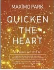
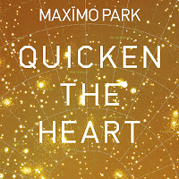
 < Original picture
 < On this picture I used a pixilating effect as i thought it would look really good. I like the way the pixels break up the picture but you can still make out what the picture is.
 < Next I used a wave effect, as you can see it has worked quite well and brings out the vibrant colours in the cover. I like the way the ripple has shuffled the picture but how its still interesting to look at.
 < I then used a Dry Brush effect, which has turned out almost perfect to what I imagined it to turn out like. I like the way the effect has changed the picture and made it look sort of cartoon like. This is the kind of effect that I wanted to create as it’s the same effect that The Feeling used in some of their past single and album covers. If I were to use this picture in any final piece I would think about changing the colours after I did the original effects as the vibrant image turned out darker and more shaded that it has come out in other effects I did.
 > I used a Small Brush effect which has given the picture a slight blur, this makes it hard to read the writing and tell what the picture actually is. Even though the effect didnt turn out the way I wanted to I still like they way it has ended up, i like the way it looks almost bumpy due to the smuge and brush strokes.
 > This was the last effect that I used, I decided to darken the colours in the vibrant cover and then inject it with a hint of purple. I like the way that the purple looks between the roots of the cover. Although i may not use this effect when editing my CD cover, its still useful to know how do change the colours of a picture so in case I need to I can.